In summary:
- Intense, bright colors can physiologically overstimulate a sensitive child, while muted colors with the right undertones can actively soothe them.
- The key is not just the color but its properties: use matte finishes to diffuse light and choose pastels with warm undertones for north-facing rooms to avoid a “muddy” look.
- A successful calming space uses a monochromatic color family to reduce visual clutter and balances it with natural textures to add warmth without stimulation.
As a parent, you want your child’s room to be more than just a place to sleep; you want it to be a sanctuary. When you have a sensitive or hyperactive child, this desire becomes a crucial mission. You’ve likely heard the common advice: use soft blues and greens, avoid bright red. While well-intentioned, this guidance often oversimplifies a complex and powerful tool. It treats color as mere decoration, when in fact, it is an active environmental cue that communicates directly with your child’s nervous system.
The conventional approach misses the nuances that make a space truly calming versus simply bland or, worse, unintentionally agitating. What if the secret isn’t just about picking a “calm” color from a paint chip, but about becoming a sensory architect? What if the real power lies in understanding the subtle physics of how color, light, and texture interact to either soothe or disrupt a sensitive mind? This isn’t about following trends; it’s about using color psychology to actively regulate your child’s environment.
This guide will move beyond the basics. We will explore why certain colors can physically increase agitation, how to choose and test colors that won’t fall flat in your real-world lighting, and how to master elements like paint finish and strategic accents to create a space that feels like a gentle, supportive hug for your child.
To help you navigate these principles, we’ve broken down the key strategies into a clear roadmap. The following sections will guide you step-by-step through the science and art of creating a truly serene and supportive environment for your child.
Contents: A Parent’s Guide to Calming Colors
- Why Bright Red Walls Can Increase Heart Rate and Aggression?
- How to Test Pastels so They Don’t Look “Muddy” in North-Facing Rooms?
- Single Shade or Color Family: Which Is More Soothing for Anxiety?
- The Sterility Mistake That Makes a Room Feel Cold Instead of Clean
- Matte or Eggshell: Which Finish Softens the Light Best?
- Blue-Blocking Glasses or Smart Bulbs: Which Is More Effective for Families?
- The Paint Mistake That Makes a Room Feel Agitating Instead of Energetic
- How to Position Mirrors to Double Natural Light in Dark Rooms
Why Bright Red Walls Can Increase Heart Rate and Aggression?
The advice to avoid bright, saturated colors in a hyperactive child’s room is not just a matter of taste; it’s rooted in physiological science. Intense colors, particularly those on the warm end of the spectrum like vibrant red, are not just seen by our eyes—they are felt by our bodies. For a child whose nervous system is already on high alert, a room painted in a high-energy color can feel like a constant, low-grade alarm. This isn’t a metaphor; as Well Built Places Consultancy notes in their research, “Bright and intense colours, like reds, oranges, and yellows, can be overstimulating and may increase hyperactivity and agitation.”
The wavelength of red light is one of the longest in the visible spectrum, which makes it highly attention-grabbing. It’s why stop signs and emergency alerts use this color. In an interior space, this translates into a demanding visual environment that requires significant mental processing. Instead of allowing the mind to rest, it commands attention. In fact, specific research shows that red walls can trigger a genuine physical response, including an elevated heart rate and even feelings of aggression. The color essentially tells the body to be ready for action, a state that is the exact opposite of the calm and focus we want to encourage.
Therefore, when designing a space for a sensitive child, the first principle is to reduce demanding visual input. This means steering clear of large expanses of highly saturated colors that put the nervous system to work. The goal is to create an environment that asks for nothing and allows the mind to settle, rather than one that is constantly shouting for attention.
How to Test Pastels so They Don’t Look “Muddy” in North-Facing Rooms?
So, you’ve decided to use soft, muted pastels—a classic choice for a calming room. But a common pitfall awaits: the beautiful, soft sage on the paint chip turns into a dull, “muddy” gray on your wall. This often happens in rooms with cool, indirect light, especially those facing north. The reason lies in a color’s undertone and its Light Reflectance Value (LRV).
North-facing light is naturally cool and blue-toned. If you paint the walls with a pastel that has a cool undertone (like a lavender-pink or an icy blue), the cool light will amplify those undertones, washing out the color and making it feel drab and lifeless. To counteract this, you need to choose pastels with warm undertones—think of a peachy-pink, a creamy beige, or a warm sage green. These warm undertones will balance the cool light, helping the color retain its intended character and warmth.
This is where testing becomes a non-negotiable step. Looking at a small paint chip is not enough, as the color will change dramatically based on the light and surrounding surfaces in the room. A systematic approach is needed to ensure your calming color doesn’t become a depressing one.
Your 3-Step Pastel Testing Plan for Tricky Lighting
- Choose Warm Undertones: When selecting samples for a north-facing room, specifically ask for pastels with warm, creamy, or peachy undertones to counteract the naturally cool light.
- Check the LRV: Look for the Light Reflectance Value on the paint swatch. For a calming but not drab feel in lower light, an LRV between 60-85 is ideal. It ensures the color reflects enough light to feel airy.
- Paint Large Swatches: Paint large sample squares (at least 2×2 feet) on the main wall opposite the window and on an adjacent wall. Observe them at different times of day (morning, noon, evening) to see how the color shifts.
This section provides a comparative look at which undertones work best depending on your room’s natural light, based on an analysis of how light affects color perception.
| Light Type | Recommended Undertones | Colors to Avoid | LRV Range |
|---|---|---|---|
| North-facing (cool) | Warm undertones: peachy-pink, creamy beige, warm sage | Cool undertones: lavender, cool gray, icy blue | 60-85% |
| South-facing (warm) | Cool undertones acceptable | Overly warm yellows | 50-75% |
Single Shade or Color Family: Which Is More Soothing for Anxiety?
Once you’ve chosen your primary calming color, the next question is how to apply it. Should you paint the entire room one single shade, or is it better to use a family of related colors? While a single, uniform color can be simple, a monochromatic color scheme—using various tints, tones, and shades of one single color—is often far more effective for reducing anxiety and visual overstimulation.
The human brain is wired to seek out and process differences. When a room is filled with high-contrast colors, the brain must constantly work to interpret the boundaries and relationships between them. For a hyperactive child, this can create a sense of visual “noise” and mental clutter. A monochromatic scheme, however, drastically simplifies this task. The eye moves effortlessly from a light powder blue to a mid-tone slate blue to a deep navy blue, as the transitions are harmonious and predictable. This creates a deeply restful and cohesive environment that minimizes the brain’s processing load. In fact, a case study showed that a one-color-family approach helped a child with ADHD to focus better and feel significantly calmer.
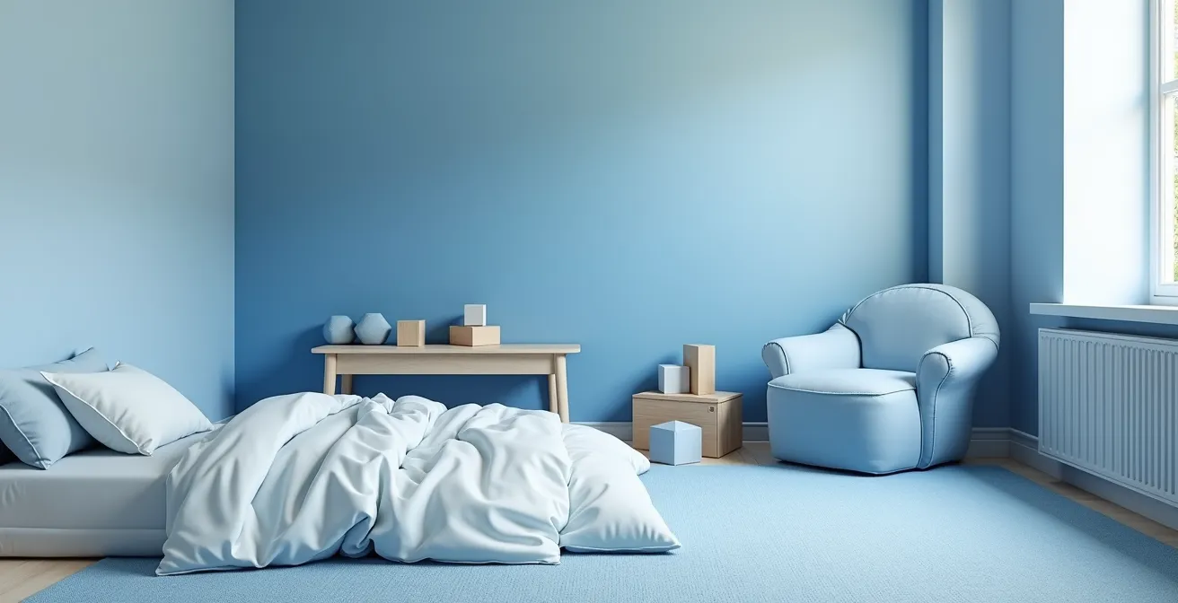
As shown in the image above, this strategy can also be used to create subtle “zones” within a room without adding visual clutter. You could use the lightest shade in the sleep area to promote rest, a mid-tone in the play area, and a darker, cozier shade in a reading nook. The room remains harmonious and uncluttered, but the gentle shifts in color provide a subtle structure that can help a child transition between activities. This approach delivers both visual simplicity and sophisticated design, creating an environment that is both nurturing and functional.
The Sterility Mistake That Makes a Room Feel Cold Instead of Clean
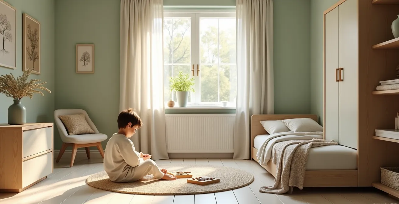
In the quest to create a calm, uncluttered space, it’s easy to fall into the “sterility trap.” This happens when you strip out not just clutter and bright colors, but also texture and warmth, leaving a room that feels cold, clinical, and unwelcoming rather than clean and serene. A stark white or cool gray room, while technically “low-stimulation,” can lack the essential feeling of comfort and safety that a sensitive child needs. The goal is to reduce visual noise, not to eliminate all sensory input.
The solution is to introduce warmth and texture through natural materials and carefully chosen neutrals. As designer Katie Bowen notes, “Earth tones can help keep you calm while also being visually stimulating” in a gentle, non-overwhelming way. Instead of a pure, brilliant white, consider an off-white with creamy undertones or a versatile “greige” (a mix of gray and beige). These colors feel soft and inviting, not harsh. Furthermore, integrating natural textures provides gentle sensory input that is grounding rather than agitating. According to findings from therapeutic design expert Trish Buscemi, muted brown tones, alongside blues and greens, are excellent choices for “creating warmth without overstimulation.”
Here are five simple ways to layer in this essential warmth without resorting to bright, stimulating colors:
- Incorporate light-colored wood for furniture, shelving, or picture frames to add an organic element.
- Use natural fibers like wicker for storage baskets or jute for area rugs.
- Layer different textures in similar neutral tones, such as a chunky knit blanket on a smooth cotton duvet.
- Choose high-pile rugs in soft, neutral shades to provide tactile comfort underfoot.
- When selecting whites or grays, always opt for versions with warm, creamy undertones to avoid a clinical feel.
Matte or Eggshell: Which Finish Softens the Light Best?
The color you choose is only half the story; the paint finish you select plays an equally important role in managing the sensory environment. The finish determines how light interacts with the painted surface, which can either create jarring “hot spots” of glare or a soft, diffuse glow. For a child sensitive to visual stimuli, this distinction is crucial. The primary contenders for a calming space are matte and eggshell, but one has a clear advantage.
The science is straightforward. A glossy or semi-gloss finish reflects light like a mirror, creating sharp, focused points of glare known as specular reflection. This can be visually irritating and distracting. An eggshell finish has a slight sheen, which makes it easier to clean but also means it will produce some subtle hot spots. A matte finish, on the other hand, is non-reflective. Its microscopic texture scatters light in all directions, creating a soft, even, and diffuse illumination across the entire surface. The fundamental paint finish physics shows that this diffusion effectively eliminates glare, which is a major source of subconscious visual irritation.
While matte finishes were once considered difficult to maintain, modern paint technology has produced highly durable and washable matte options, making them a practical choice even for a child’s room. By choosing matte, you ensure that the calming color you so carefully selected is rendered in the softest possible way, turning the walls into a gentle backdrop rather than a source of distracting light.
The following table, based on guidance from the ADD Resource Center, breaks down the sensory impact of different finishes.
| Finish Type | Light Reflection | Sensory Impact | Maintenance |
|---|---|---|---|
| Matte | Non-reflective, diffused | Most calming, no glare | Modern washable options available |
| Eggshell | Slight sheen, some hot spots | Can create subtle irritation | Easy to clean |
| Satin | Noticeable sheen | Creates specular reflection | Very washable |
Blue-Blocking Glasses or Smart Bulbs: Which Is More Effective for Families?
Creating a calming environment extends beyond paint and into the very quality of light itself, especially as bedtime approaches. We know that blue light from screens and harsh overhead lighting can disrupt the production of melatonin, the sleep hormone. Two common solutions are blue-blocking glasses and smart bulbs. While glasses are a personal solution, smart bulbs offer a more powerful, environmental approach that benefits the entire family and reinforces a collective wind-down routine.
Blue-blocking glasses work by filtering out disruptive light for the individual wearer. However, they don’t change the ambiance of the room, and getting a child to wear them consistently can be a challenge. Smart bulbs, on the other hand, transform the entire space. As the ADD Resource Center explains, “Smart bulbs are an ‘environmental’ solution, changing the entire room’s ambiance to promote a collective family wind-down.” This creates a powerful, non-verbal cue that signals to everyone’s brain that it’s time to prepare for sleep.
By programming a “digital sunset,” you can automate this transition, making it a seamless and consistent part of your evening routine. This involves gradually shifting the color temperature of the light from a cool, daytime white to a warm, candle-like amber, while also slowly dimming the brightness. This mimics the natural progression of sunset and provides a potent signal to the body’s circadian rhythm.
How to Program a “Digital Sunset” for Your Child:
- Install smart bulbs in your child’s bedroom and the main family living areas.
- Use the bulb’s app to create an automatic schedule that begins 60-90 minutes before bedtime.
- Set the schedule to shift the light from a cool white (around 4000-5000K) to a very warm amber (2200-2700K) over this period.
- Simultaneously, program the brightness to dim gradually from its evening level down to about 30%.
- Sync this lighting schedule with bedtime activities: brighter for cleanup, dimming for storytime, and very low for the final moments before sleep.
Key Takeaways
- The goal is not to eliminate stimulation but to control it. Use a monochromatic color family with varied textures to create gentle, calming interest.
- Light is as important as color. Use matte paint finishes to eliminate glare and program smart bulbs to create a “digital sunset” that supports natural sleep rhythms.
- Always test large paint samples in your actual room. A color’s undertone and the room’s natural light (especially cool, north-facing light) will dramatically change its appearance.
The Paint Mistake That Makes a Room Feel Agitating Instead of Energetic
Sometimes parents want to add a splash of “fun” or “energy” to a room with a bright accent color. But for a hyperactive child, there’s a fine line between energetic and agitating. The common mistake is using too much of a high-saturation accent color, which disrupts the calm of the space and creates a jarring point of high contrast that the eye is constantly drawn to. This can be just as overstimulating as painting an entire wall red.
The key to using accent colors successfully is balance and proportion. Instead of an equal partnership between neutral and bright, think of it as a quiet backdrop with a carefully placed whisper of color. A widely accepted guideline in sensory-friendly design is the 80/20 rule. In this context, design research indicates that an 80-90% base of calming neutrals paired with just 10-20% of a more energetic accent color is optimal. This provides a touch of personality and visual interest without overwhelming the nervous system.

The visual difference between a muted and a vibrant color goes down to a textural level. A high-saturation color, as seen on the right side of the image, can appear to “vibrate,” creating a subconscious level of visual agitation. A muted color, on the left, absorbs and softens light, appearing more organic and restful to the eye. When choosing an accent, opt for a color that is more saturated than your neutral base, but still has a slightly muted or “earthy” quality to it, such as a dusty teal, a burnt orange, or a mustard yellow, rather than a pure, electric primary color.
How to Position Mirrors to Double Natural Light in Dark Rooms
Light is the ingredient that brings color to life, and maximizing natural light is a powerful way to make a space feel more open and calming. Mirrors are a well-known tool for this, but in a room for a hyperactive child, their placement must be highly strategic. A poorly placed mirror can introduce distraction and visual clutter, counteracting all your careful color choices. The goal is to use mirrors to amplify soft light, not to create distracting reflections.
The most common mistake is placing a mirror directly opposite a window. This can create intense glare when the sun is bright. Instead, place mirrors on walls adjacent to windows. This allows them to catch the light at an angle and bounce it softly into the darker corners of the room, creating a gentle, diffuse glow rather than a harsh beam. Another crucial rule is to be mindful of what the mirror reflects. A mirror that reflects a cluttered toy corner or a busy doorway doubles the visual chaos. Ensure your mirror reflects a calm surface, such as a blank, softly colored wall or the tranquil view out the window.
For a sensitive child, it’s also important to consider the potential for distraction. A mirror placed at a child’s eye level in a play or study area can pull their focus away from their task. To avoid this, follow these best practices:
- Use one large, simple mirror rather than a mosaic of smaller ones, which can create a fragmented, “fun-house” effect.
- Position the mirror at adult height to amplify light without constantly capturing the child’s reflection during floor-time activities.
- Choose a mirror with a simple, minimal frame that matches the room’s muted color palette to ensure it blends seamlessly into the environment.
Ultimately, every element in the room should contribute to a cohesive, low-stress environment. As research from Higgins et al. emphasizes, “A consistent and simple colour scheme can help individuals with ADHD by reducing visual clutter and promoting a sense of order.” A strategically placed mirror supports this goal by enhancing light in a way that is organized and calming, not chaotic.
By thoughtfully applying these principles of color, light, and texture, you transform from a decorator into a true architect of your child’s well-being, creating a space that actively supports their journey toward calm and focus. The next logical step is to begin planning your own project with these sensory-friendly strategies in mind.